Client
The Client is a large pizza company with a global franchise.
Today it includes about 790 pizza stores in 15 countries worldwide.
Project idea
Mobile design
It was a curious client with a striking personality. First of all, it’s an IT company. Even though they didn’t have their own mobile developers when they contacted us. But as well as many other things, at the pizza company, anything you need is quick to come up, evolve, and reach the point of excellence.
Perfectionism is the other thing that brings our companies together. That’s why even today, several years after we finished this project, we still recognize the key concepts introduced into the mobile app by our designers.
Pre-sales in China
The value of the pizza company as a business is that they have in-house operations only, which sets them apart from other fast-food restaurants and restaurant chains. However, they didn’t have any expertise in mobile interfaces, that’s why in 2016 at the second attempt they announced a tender for a quick launch in China.
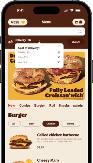
The test assignment with cultural identity led us to study the specifics of the Chinese mobile market searching for insights. Asian designs are always more emotional, packed with vibrant colors and plenty of details. This task turned out to be a real challenge.
For example, we’re used to the fact that a cart icon looks like a shopping cart, while in Chinese apps it looks like a paper bag. As a result, our team of designers came up with a fantastic concept of the pizza delivery app for China.

The Client’s team was really impressed by how deep into detail we went and how much time we spent, and finally chose us as their designers. However, it wasn’t the first time that we won tenders by doing a very thorough job — this is where the value of our business lies.
Solution
Design for iOS created in 3-day iterations
Once in three days, we showed what we came up with based on the workshops we had at the start of each period. The mobile product manager at the company gave us his feedback and told us where to go from there, we did the tasks during the following 3 days and in about a month we had the app design for iOS.
Our task was to lay the groundwork for the app, in other words, its architecture in terms of the UI, which the client could then build on adding new options.

Universal structure of the app
Considering that the company is international, the future app had to adjust to the region it would be used in and have a completely different look while remaining just as performant as it was, no matter the region.
In the process of building the project, the Client’s strategy changed and it was decided to first write an app for its Country, which would then be deployed in other countries by the Client himself. The project we made at pre-sales got everyone convinced that we have it in us to create a scalable product.

While the app was in progress we did some work on the website improving the processes of selecting and ordering pizza. In addition to that, we gave the Client a hand with their product pitch for franchisees and afterward spent time looking forward to the release.

Geolocation by delivery areas
In this mobile app, we couldn’t simply add a regular map where users would specify their address. The logistics of the pizza company is all about limited delivery areas: if you’re not in one of them, there’s no chance you’ll get pizza. Meanwhile, an area can cover as little as a third of your city. This had to be somehow made clear to users.
Typically, an app aims to make users add their items to the cart and then deal with the rest. Here, on the other hand, loomed a prospect of being left without pizza when the order is nearly made — all because you’re outside the delivery area. We simply couldn’t let that happen, that’s why we started the customer flow with geolocation.

iOS design adapted to Android
It so happens that our team of designers likes iOS better than Android. Flexible guidelines of Apple’s Human Interface let designers draw iOS apps with a clearer understanding of interactions and pay more attention to details. That’s why we start with iOS and only then transfer the detailed screens into Google Material Design, where the guidelines are more rigid.
The whole process took as little as two months: two weeks on the app design for the local market, iOS design, Android design, and testing each. Our experience in the food and e-commerce industries made it easier to implement the project quicker and avoid any extra efforts and costs. However, the target audience of this app is enormous and this entails certain responsibilities.

Food apps are our area of expertise
The issue of covering a mobile market was very pressing, since the Client’s competitors already had mobile apps. After the app was released, 40% of the online orders were received via the app, which soon became the primary sales channel.
The founder of the pizza company once pointed out that the total number of people using the app and one more famous mobile service combined is half the number of all food app downloads in their country. And we took part in building both of the apps.

Result
The app acquires more and more new features but despite the inevitable changes and modifications it’s still based on our graphic concept.

Founder